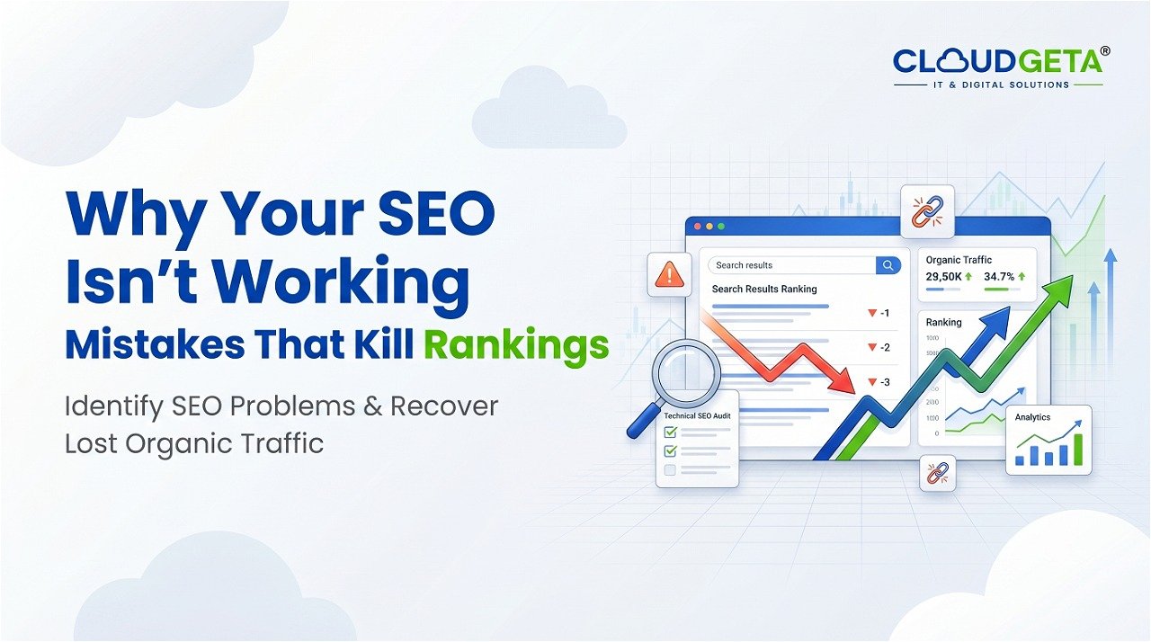
Your website is beautiful. Professional design. Great copy. Yet your conversion rate is 0.5%. Competitors with less impressive websites convert at 3%.
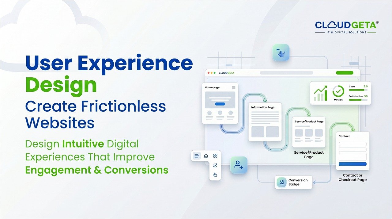
Beautiful design does not equal high conversion. Conversion depends on psychology, clarity, and friction reduction—not just aesthetics.
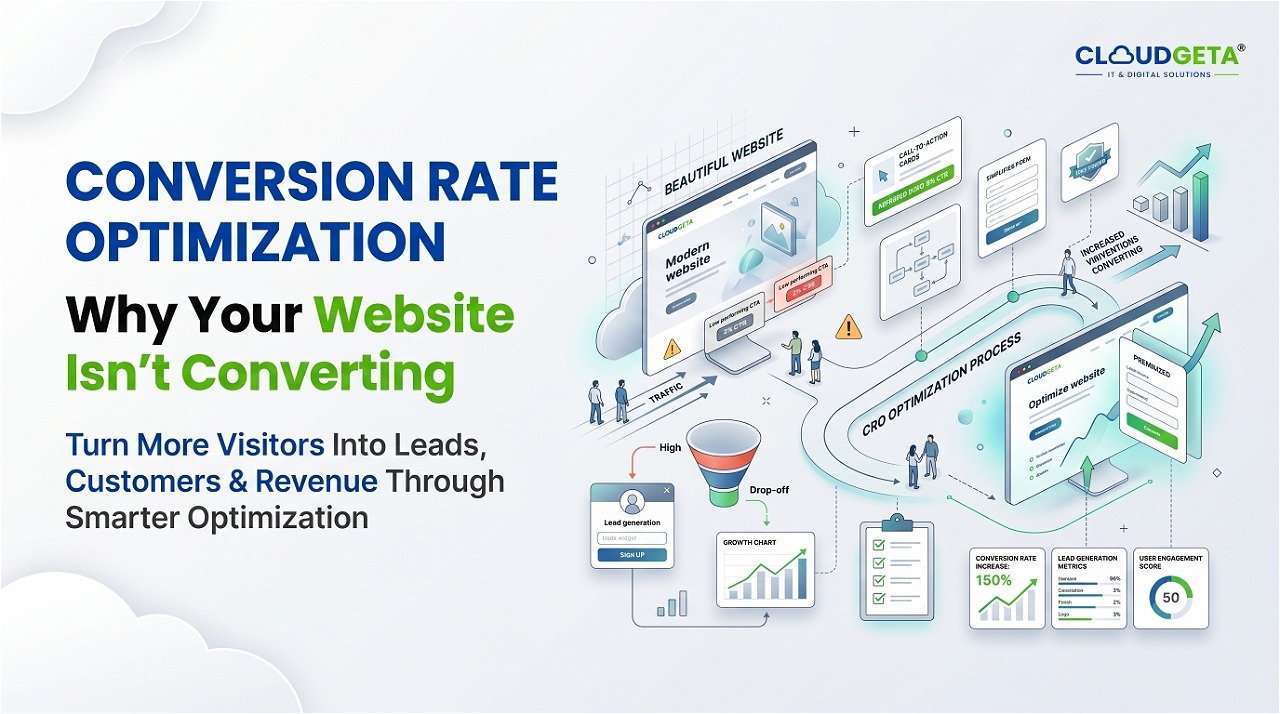
Your website probably fails on several invisible conversion killers. Your value proposition is not immediately clear. Visitors do not understand why they should care within three seconds. Your call-to-action is not obvious. Visitors do not know what action to take. Your forms require too much information. Visitors do not want to share that much data. Your site is slow on mobile. Visitors leave before page loads. Your trust signals are weak. Visitors do not believe you.
These conversion killers are fixable. Start with value proposition. Above the fold, what is your value? What problem do you solve? Why should someone care? State this clearly in fifteen words or less. If visitors need to scroll or search to find your value, you lose them.
Second: clear call-to-action. What action do you want visitors to take? Make this obvious. Your CTA button should stand out visually. Your CTA text should be action-oriented. “Contact Us” is weak. “Book Your Free Consultation” is strong.
Third: minimize form friction. Every field you ask for loses conversion. Do you really need someone’s phone number before they subscribe to your newsletter? Probably not. Ask only for what you need.
Fourth: mobile optimization. Most visitors use mobile. If your site is not optimized for mobile, you are losing over half your conversions. Mobile should not be secondary—it should be primary.
Fifth: build trust. Use testimonials, case studies, trust badges, clear policies, and professional design. People decide if they trust you in seconds.
At CloudGeta, we audit your website for conversion barriers, test optimization hypotheses, and systematically increase conversion rate through data-driven improvements.