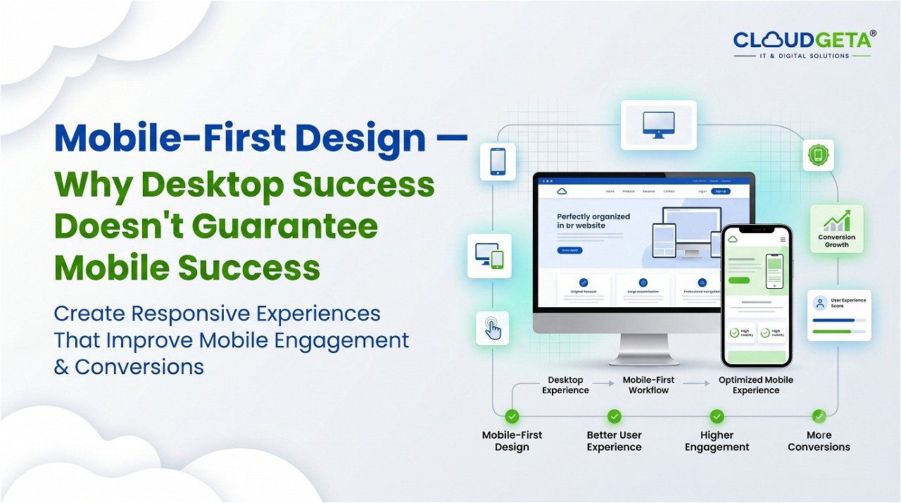
Your website has everything users need. Product features are there. Pricing is there. FAQ is there. Users still get lost and leave confused.
This is a user experience problem. User experience is about ease of use, clarity, and frictionless interactions.
Poor UX kills conversions. Users cannot find what they need. Navigation is confusing. Forms are complicated. Calls-to-action are unclear.
Good UX is invisible. Users navigate effortlessly. They find what they need without thinking. They understand what action to take. Everything feels natural.
Navigation is critical. Users should understand your site structure from the menu. What pages exist? How are they organized? Navigation should be intuitive. Visitors should understand without explanation.
Form design is critical. Complex forms reduce completion. Long forms lose people halfway. Ask only what you need. Require only what you need. Make fields optional where possible. Progressive profiling asks less upfront and more later.
Information architecture is critical. How is your information organized? Where should users look for information? Logical organization makes information findable. Poor organization makes users feel lost.
Visual hierarchy is critical. What is most important? What should users notice first? Use size, color, positioning, and whitespace to guide attention. Most important elements should stand out.
Feedback is critical. When users interact with your site, they need feedback. Did their action succeed? Should they wait? Should they try again? Visual feedback confirms interaction and guides the next step.
Consistency is critical. Similar elements should look similar. Patterns should be predictable. Users should not have to relearn how to interact with every page. Consistency builds confidence.
At CloudGeta, we design websites with user experience as the primary goal—creating intuitive navigation, frictionless interactions, and clear conversion paths.